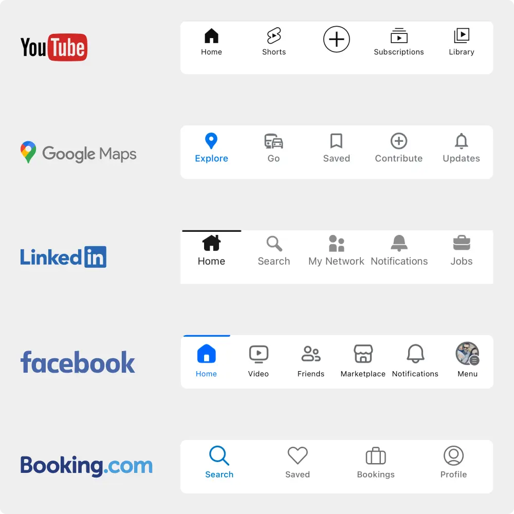
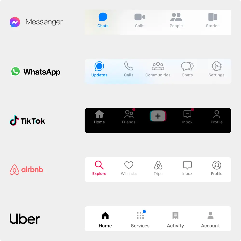
The Power of Labels — Navigation That Speaks Clearly
Look carefully and think WHAT do these bottom navbars have in common?
Even with billions of users globally and widely recognized icons, these titans of industry prioritize one fundamental design principle:
✨Clarity through Labeling.✨
Why Labels?
Despite the familiarity users might have with these platforms, each app employs labeled icons in their navigation. It's not just an icon; it’s an icon WITH a word that leaves no room for misinterpretation or confusion.
🚫 No guessing.
🚫 No ambiguity.
✅ Just clear, user-friendly navigation.
Keep in mind:
🔍 Research is Key: Delve into competitor analysis and common design patterns.
🤓 User Testing: Ensure the intuitive use of your design elements by involving users in testing phases.
🤔When in Doubt, Label: Unless your icons are universally understood (think: a ‘play’ button), always opt for labels.
Design with Intention & Knowledge:
Promoting effortless and seamless user experiences goes beyond aesthetic appeal. It’s about imbibing knowledge into design, ensuring every element serves its purpose effectively and unambiguously.