Attiki Odos Redesign
+200.000 app downloads
+260.000 vehicles every day
 No KPIs and Conversion Rates.
No data or numbers to support UX decisions.
This redesign is not just about screens.
-
Match real-life needs with a refreshed Home Screen
-
Drivers never get stuck at tolls with Automatic Top up New
-
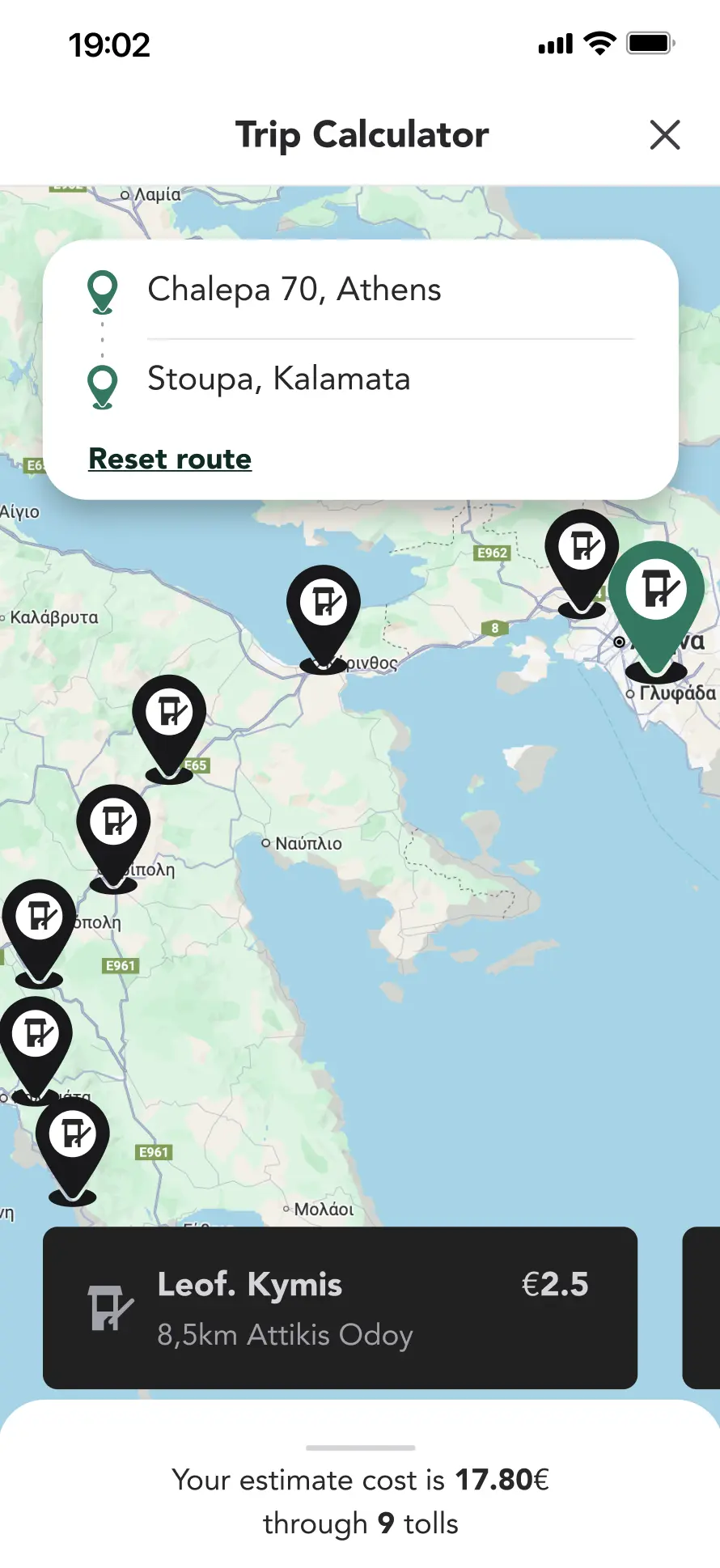
They can plan and prepare their trip with Trip Calculator New
-
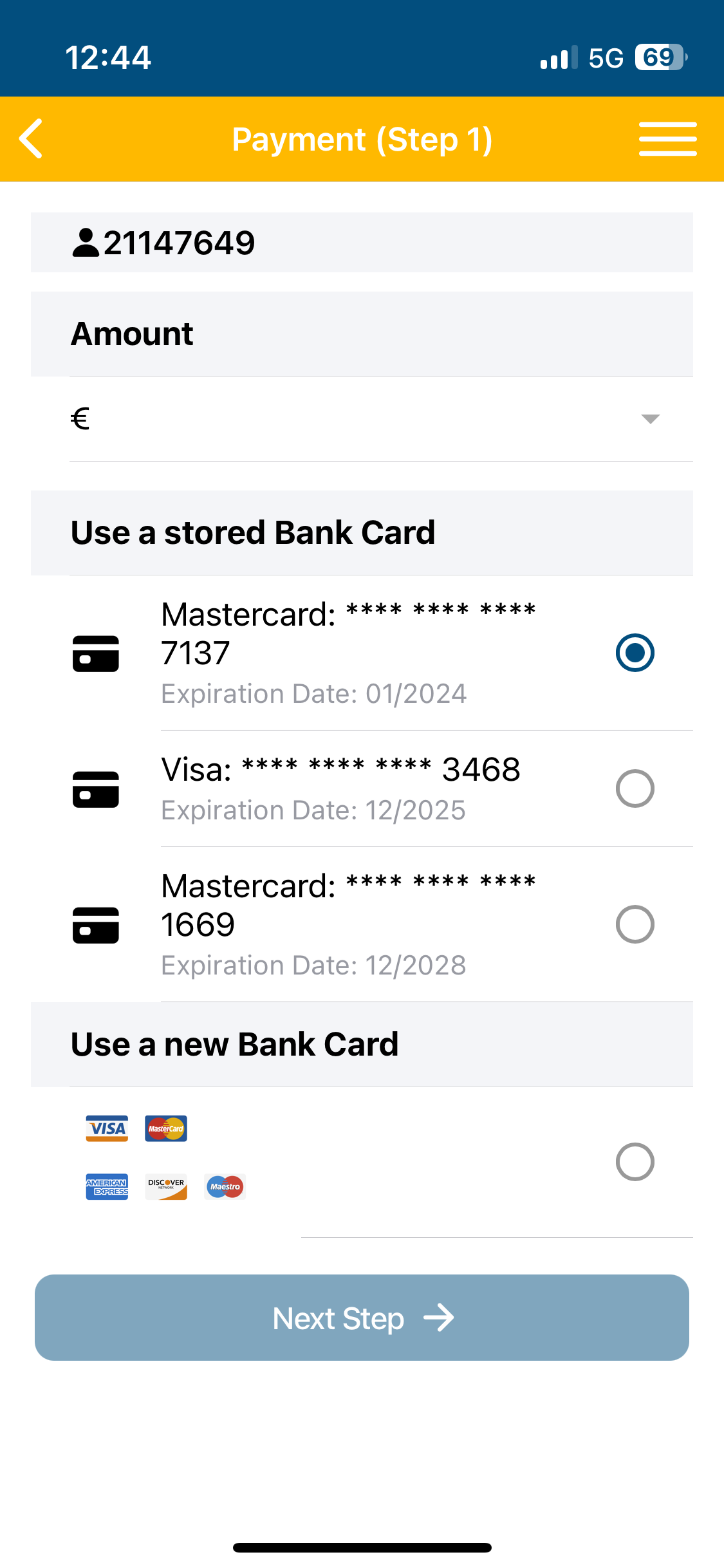
Clear, fast and transparent flow for the Payment Experience
-
See every trip at a glance with Toll Transactions
-
Quick information and export with Payment History
-
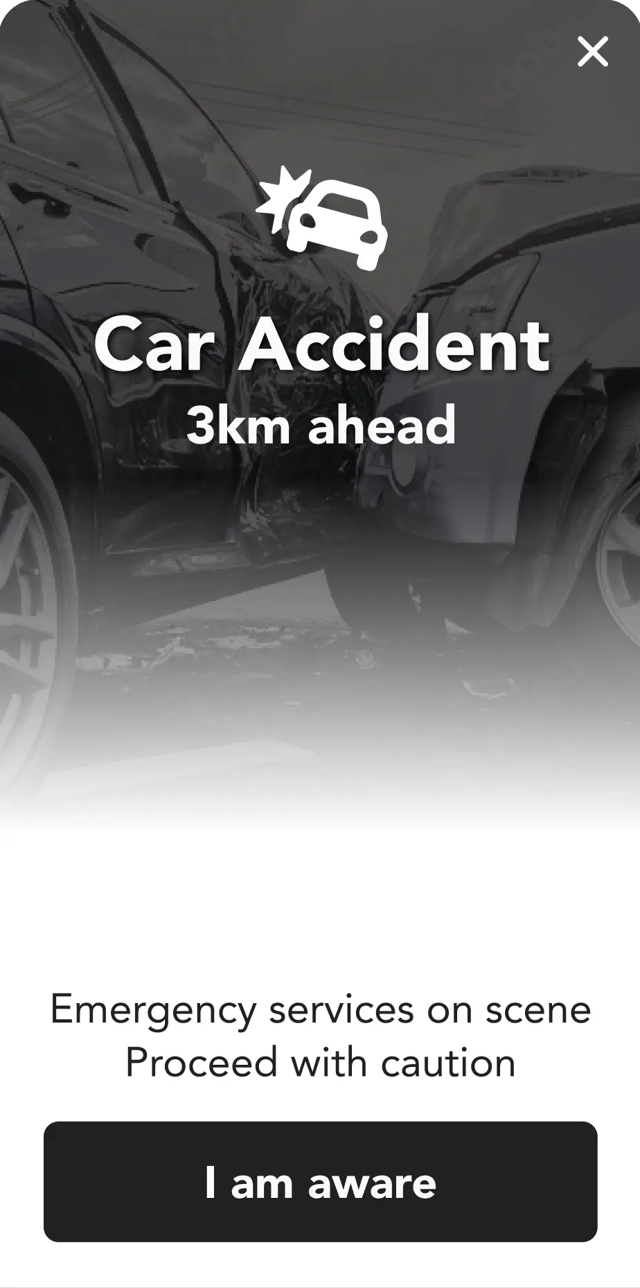
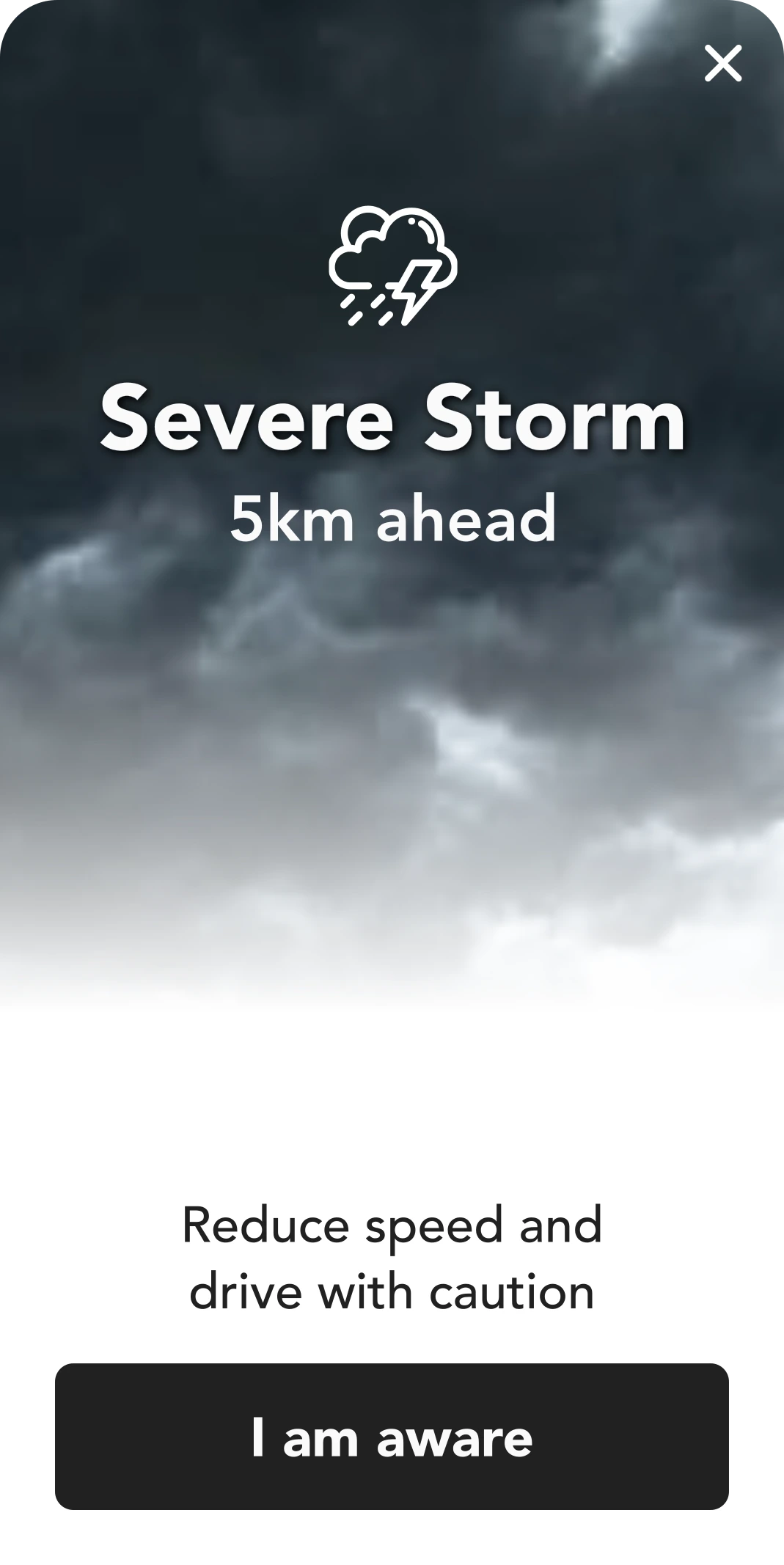
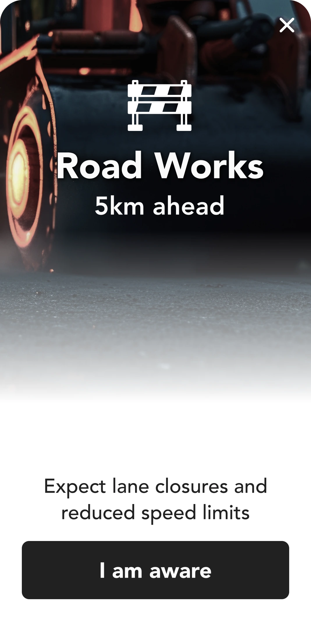
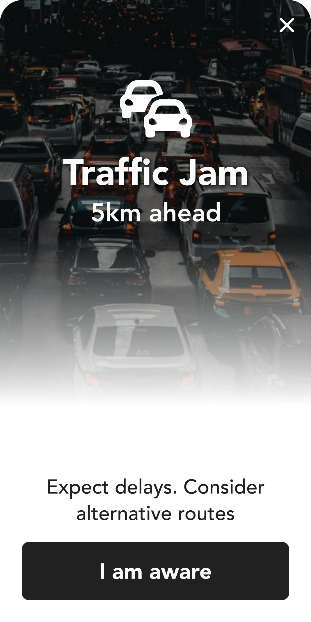
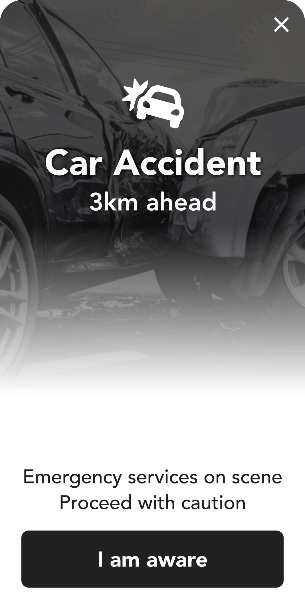
Prioritize safety with smart and targeted Alerts and Notifications New
-
Friendly and instant experience for Feedback and Support
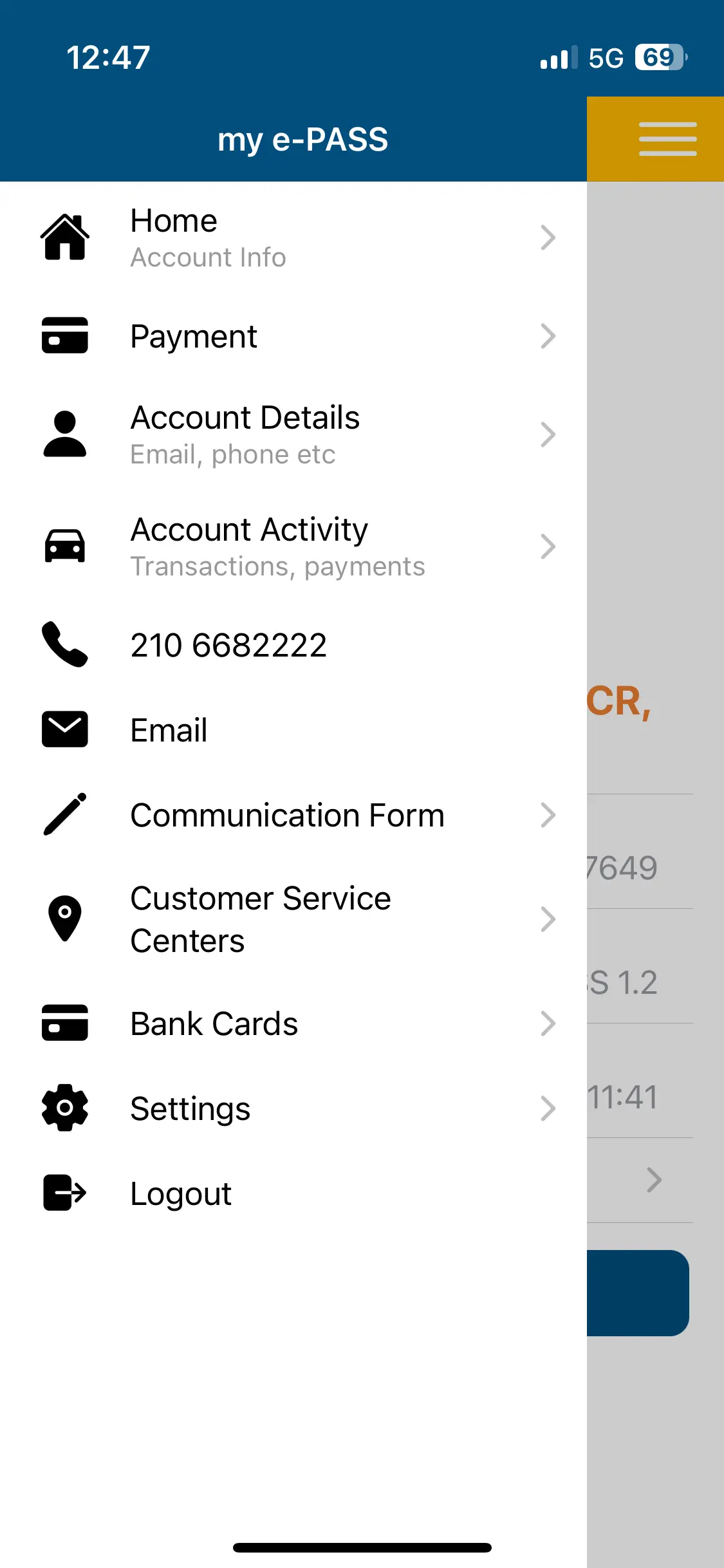
Before the Redesign
Current App Screens
The previous app handled toll payments, but not much more. It wasn’t built around the way drivers think or what they need in the moment. This section sets the stage — a static interface, scattered logic, and little emotional connection.
Mental Model Shift
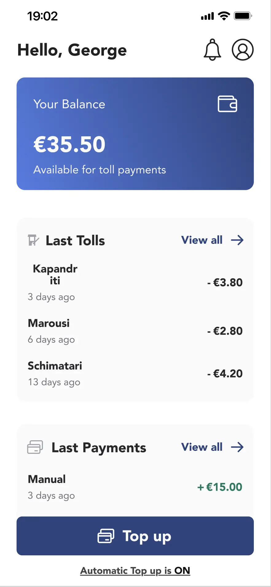
Home Screen
Instead of starting from features, we started from the driver’s mindset. What do they check first? What’s most urgent? The redesigned home screen mirrors that thinking — balance, tolls, payments, and top-up appear in the right order, with clear hierarchy and human language.
Human Touch
“Hello George” adds
warmth and builds familiarity
Grouped by Purpose
Follows user mental flow: Balance → Tolls → Payments → Top up.
Clean Visual Hierarchy
User’s balance is highlighted with breathing room and a wallet icon.
Transparency & Trust
Immediate view of last tolls and payments creates confidence.
On-State Feedback
“Automatic Top Up is ON” is clearly visible and reduces uncertainty.
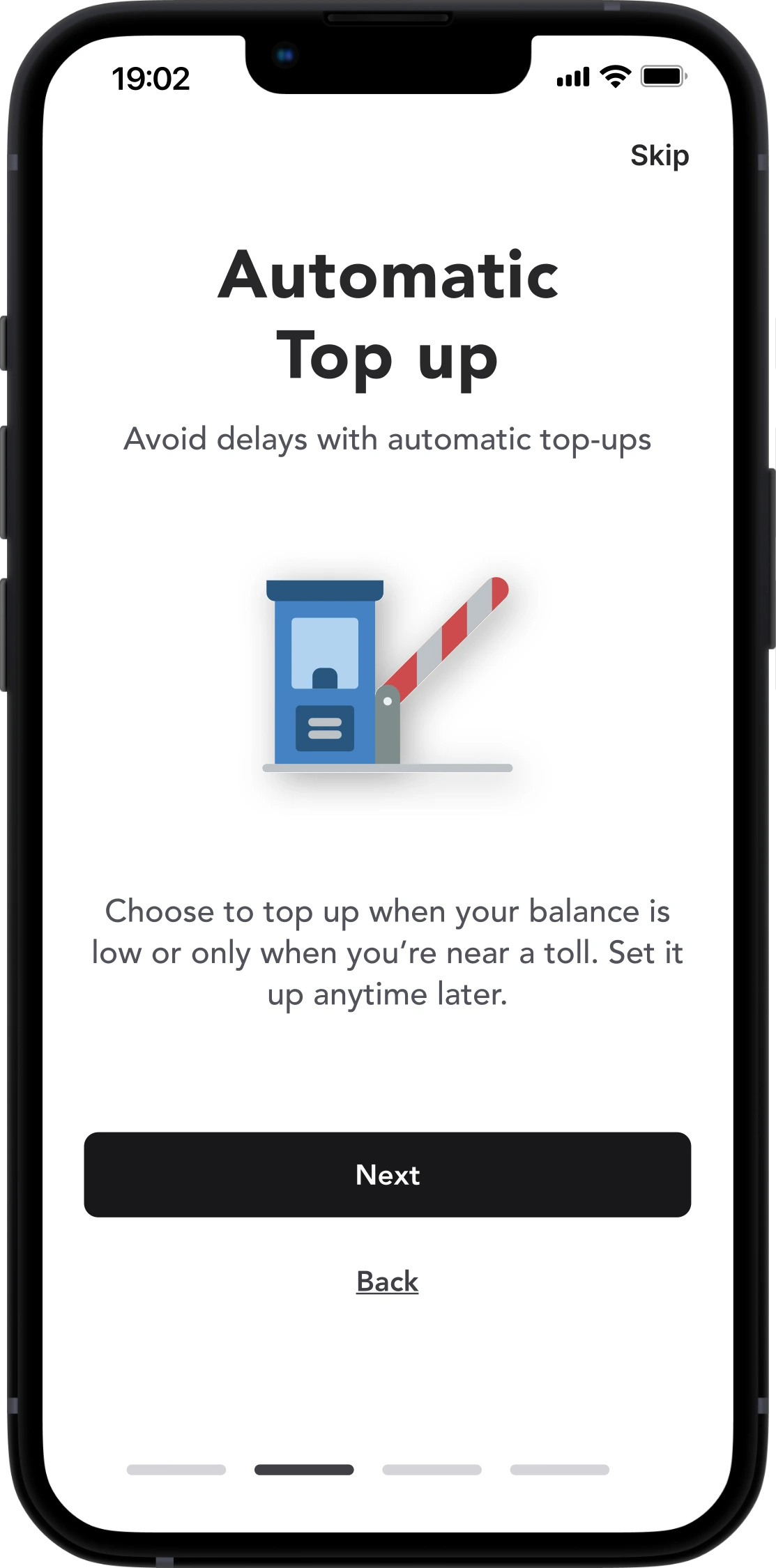
Design with drivers in mind
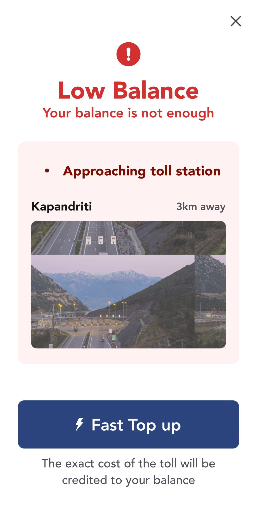
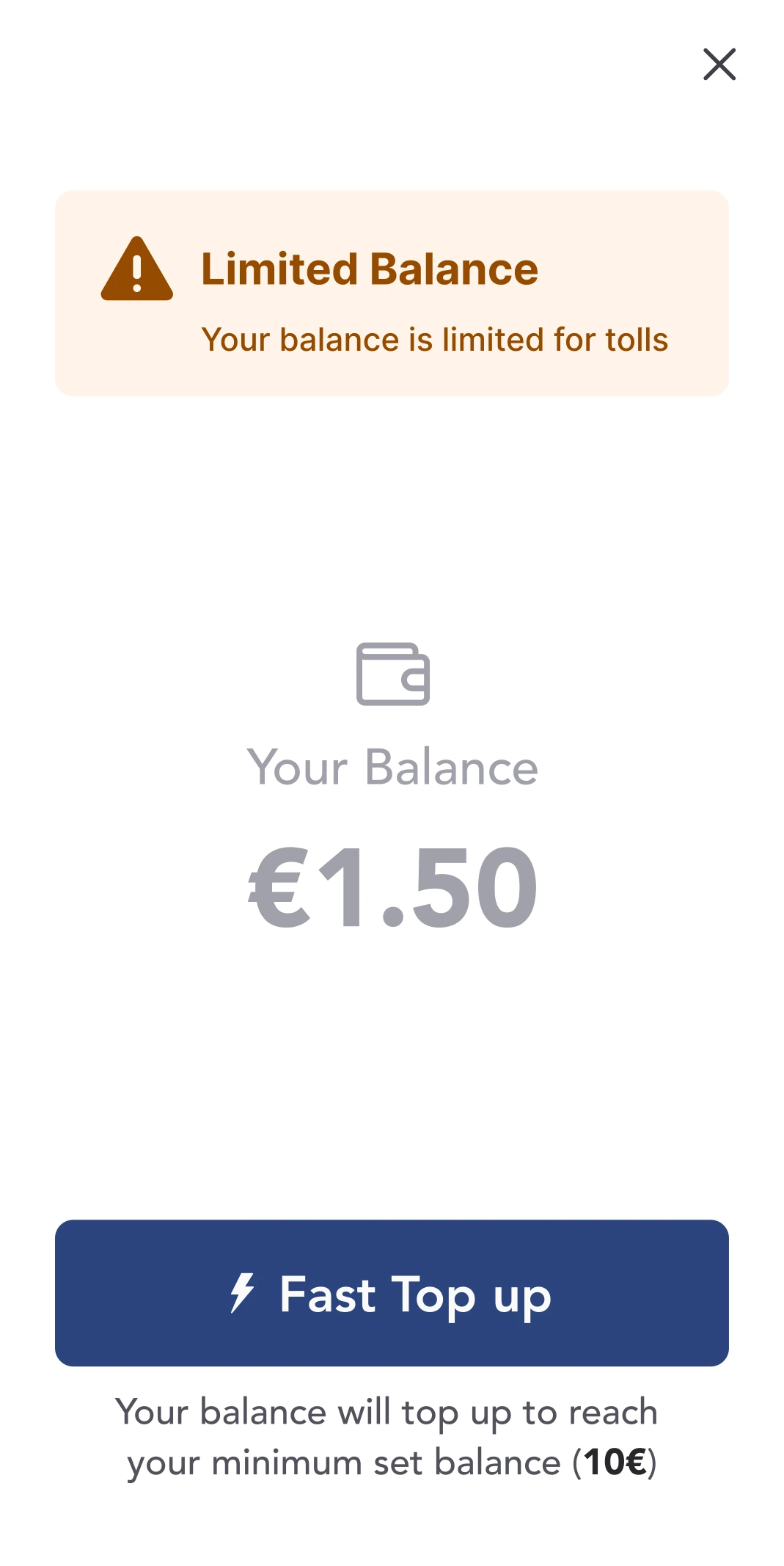
Automatic Top up
Running out of balance on the road is one of the most frustrating toll-related issues. This flow removes that friction. It’s easy to set up once, forget about it, and drive with confidence. Visual feedback and pre-filled chips do most of the work.
One Screen Clarity
All logic is visible without diving into sub-settings
Drivers in Control
Minimum steps to activate. Pre-defined chips for amount and threshold based on usage
Mental relief
Keep driving worry-free” tone encourages trust
Visual Confirmation
Clear success screen after setup
Reassurance
Drivers are aware what to expect
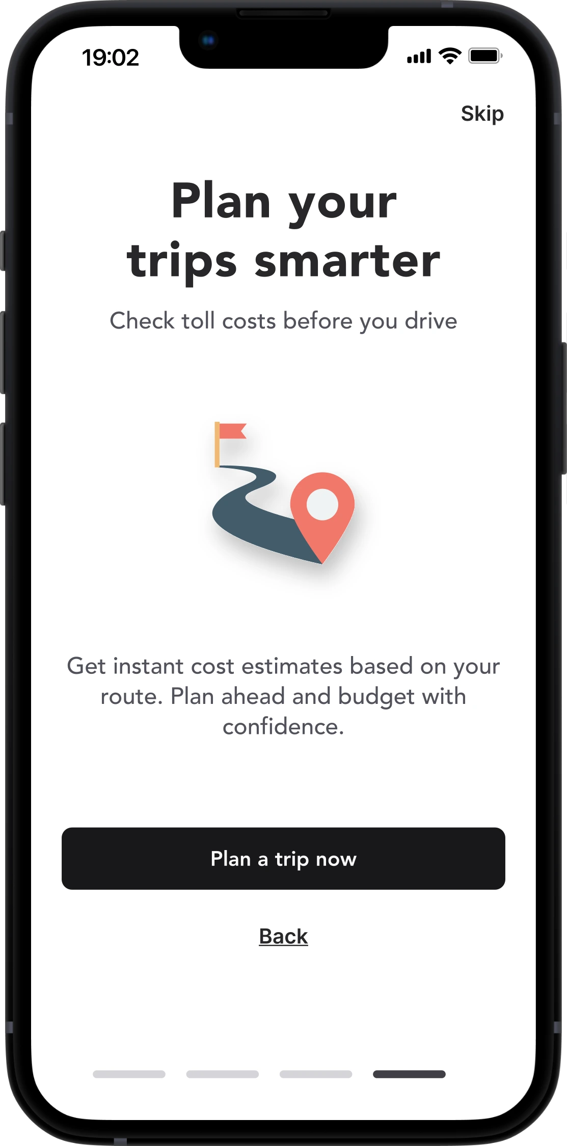
Plan Ahead. Avoid Surprises.
Trip Calculator
Drivers used to rely on guesswork or third-party tools to estimate toll costs. This built-in trip planner puts everything in one place: tolls, distance, route, and cost — all presented visually. It makes planning feel like a helpful step, not a chore.
Pre-drive Clarity
Know cost, tolls, and distance upfront
Feels Natural
Soft interactions make it feel intuitive, like using a travel planner, not a calculatore
Clear Visual Anchors
Toll points, cards and summary box are intuitive
Dual-view Options
Switch between map and list easily
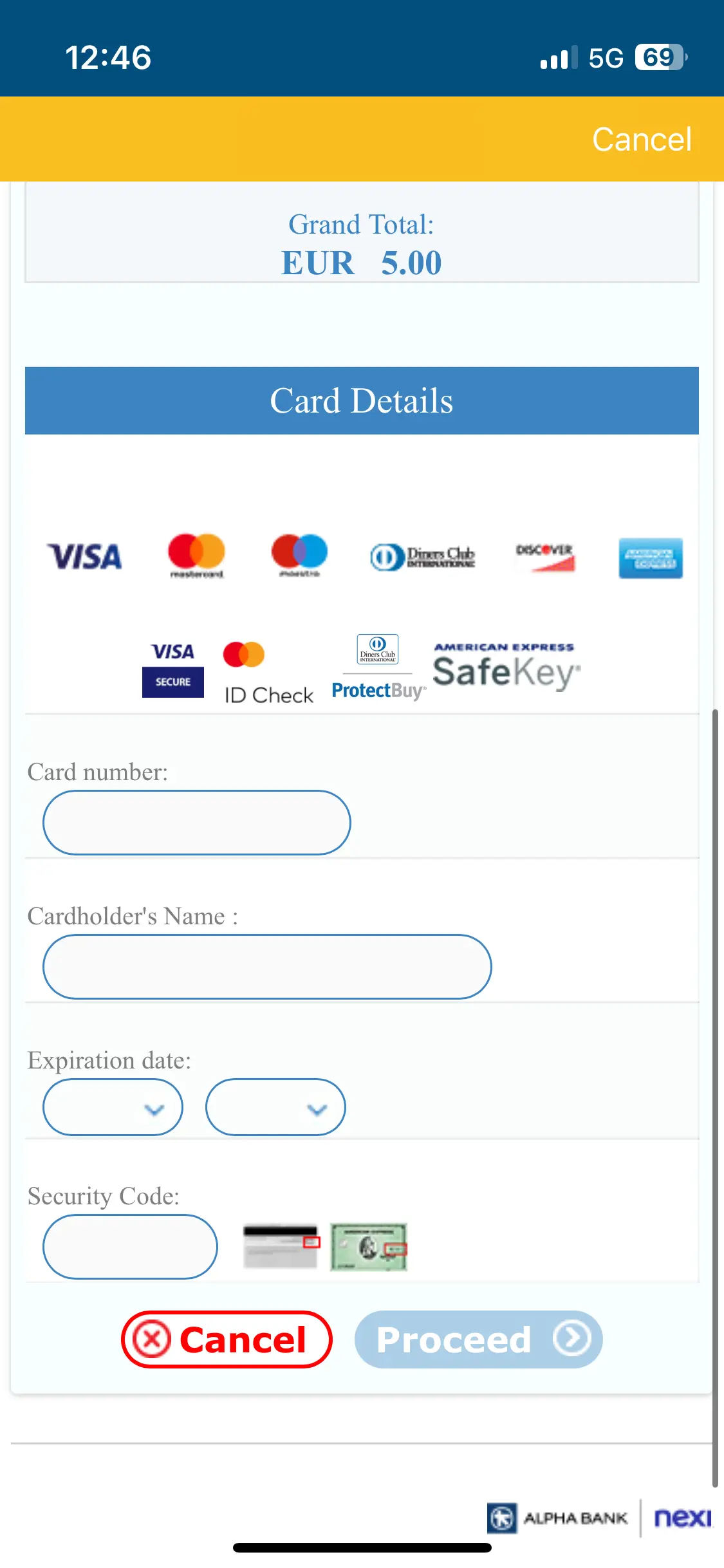
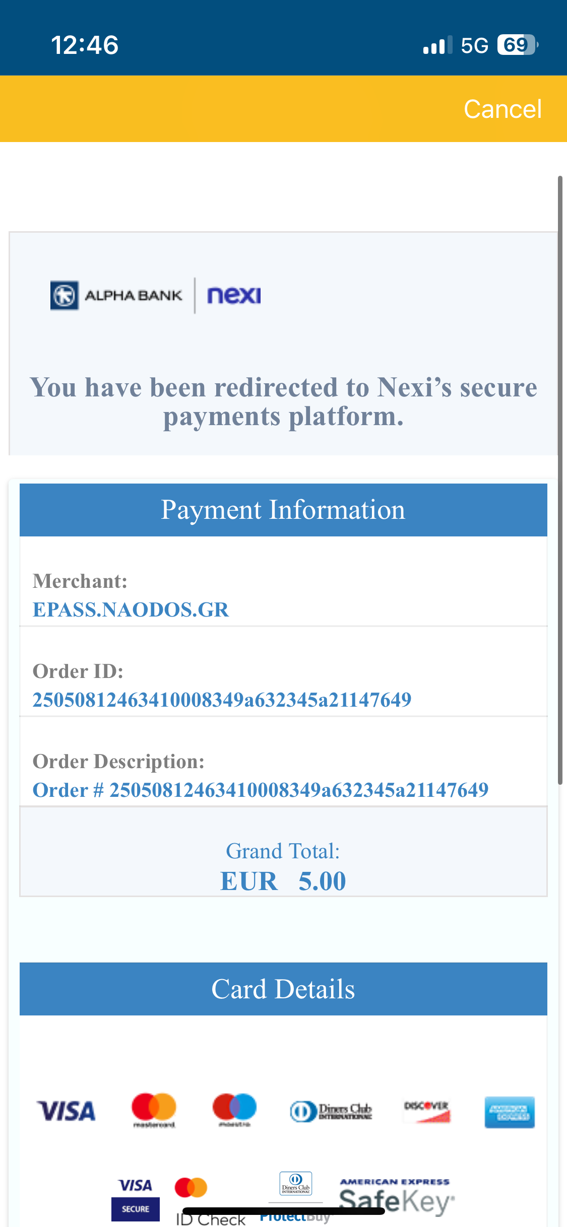
A Clearer Way to Pay.
Payment Flow
Topping up should feel quick and certain. This new flow shows real-time updates and uses known defaults to prevent errors. Even the short delay screen builds trust — it confirms the system is doing something, not just waiting.
Friendly animation
Visual confrimation for “updating your balance”
Human-centered delay screen
“Reviewing payment details” feels like a system handshake, not a blocker
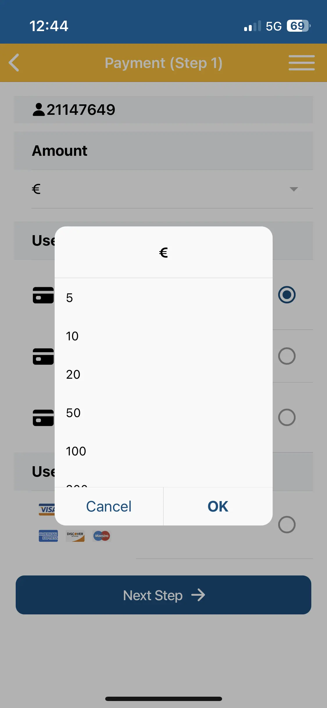
No Learning Curve
Tappable preset amounts or custom input
Error Prevention
Uses last card and chosen amount to pay to reduce change of wrong payment
Supportive Microcopy
“Your balance will update instantly” reassures and sets clear expectations


Beyond Daily Tasks
Now, let’s shift focus to what builds long-term trust: clear history, reliable payments, and helpful support.
Your Trips. Your History. Your Map.
Toll Transactions
This section gives drivers what they always wanted: clarity. Instead of hunting through menus, they see a clear summary and can switch between list and map views. Filters are fast, the design stays light, and even heavy toll history feels manageable.
Data Transparency
“You spent 35.50€ across 9 tolls” in summary card and detailed graph with detailed date view
Effortless Filtering
Choose date ranges quickly
Lightweight UI
Works even with many entries
List Map Options
View tolls in space or time
Track Fast. Export Easily.
Payment History
Finding past payments used to be tedious. We made it easier. Users can filter by date, export records, and even see how refund requests are handled. Everything is traceable and transparent — just like it should be
Guided Recovery
Refund and failure modals keep drivers informed, reassured, and in control.
Clear History
Support for exporting with different options adds real admin value
Targeted Filtering
Date filters allow fast lookups respecting drives time and intent
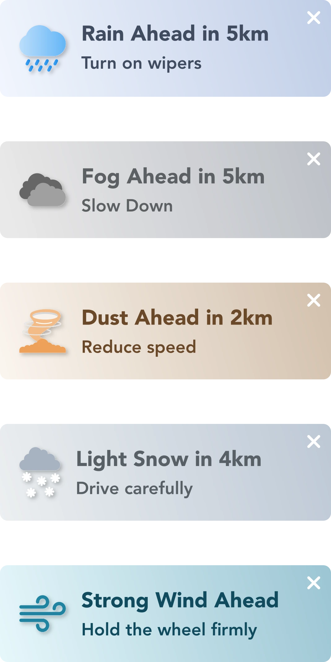
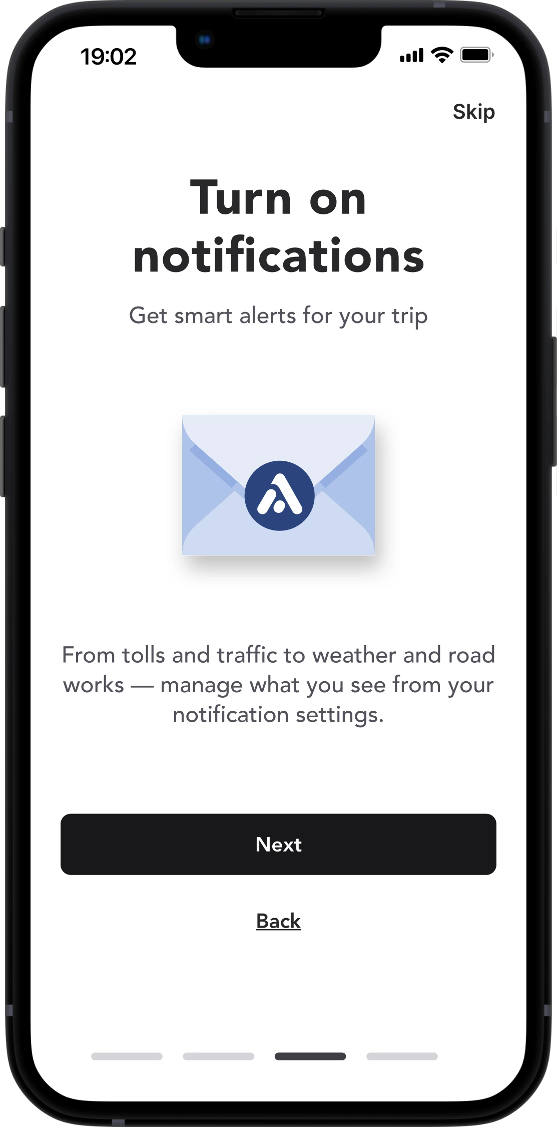
Drive Safe. Stay Alerted.
Alerts & Notifications
Built for action, not noise. We only surface what matters—safety, payments, route changes—always in context.
Drivers can focus on the road, knowing that anything important arrives clearly and on time. No clutter. No spam. Just peace of mind.
Talk to us. For Real.
Support & Feedback
Support shouldn’t feel like shouting into a void. Our new flow uses emoji ratings to invite feedback, offers visible timelines, and makes it easy to track past messages. A small feature — "reopen" — turns a closed case into a continued conversation.
Emoji-first Rating
Emotional entry point instead of abstract star logic
Animated Transitions
Delight without Delay
Message History
Builds trust and simple to track issue progress just like a support ticket and build trust
Response Time
“Estimated response: 6–9 hours” Manage expectations
Guided interaction
Topic selection + character countdown results to a structured yet open input
Reopen CTA
Makes support ongoing, not final


Bonus Content
They show how we handled first impressions, onboarding, and subtle transitions that support the full picture.
A First Impression That Fits the Road
Splash Screen
This screen lasts a few seconds, but it still matters. We used the time to signal trust, motion, and clarity.
No delays. No branding overload. Just enough to reassure, then move forward.
Efficient Entry
Screen appears briefly, confirms identily, then gets out of the way
Primed Use State
Signals movement and purpose, syncing usermindset with travel tasks
Contextual Anchoring
Splash sets the mental model. This is a travel tool, not just a payment app.
Balanced Branding
Visuals match brand tone without slowing down or distracting the user
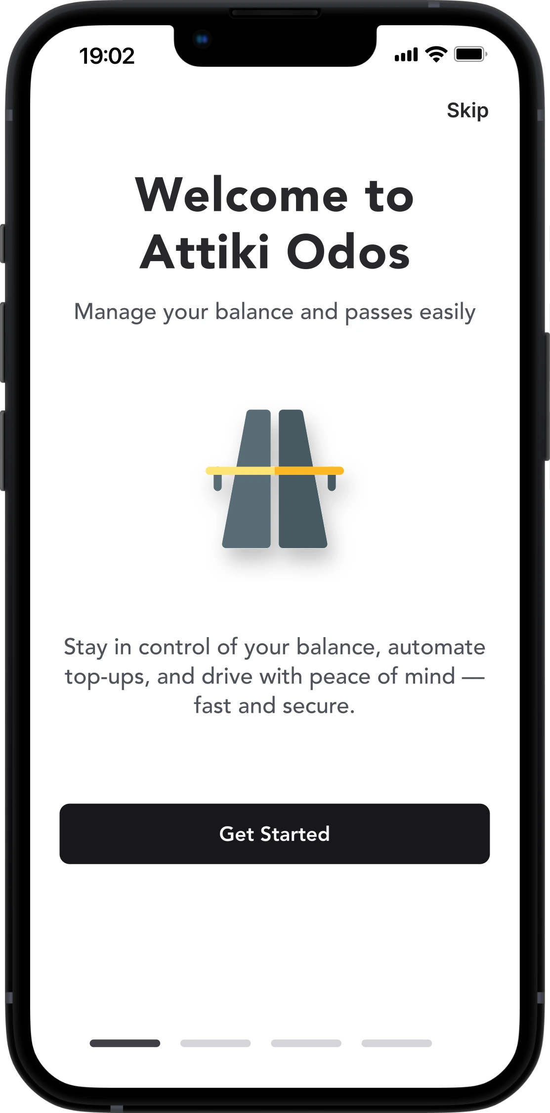
Start Fast. Stay in Control.
Onboarding
We respect drivers' time — onboarding is fast, optional, and contextual. We didn’t force onboarding.
Drivers can skip it. If they stay, they see just what they need — no fluff. The tone is human, not scripted.

Design Philosophy

Design Tactics

UX Highlights
Outcome.
This redesign spanned 100+ screens, was tested with real users, went through deep iteration and is ready to serve +200,000 drivers daily.
But more than that, it focused on how people feel behind the wheel:
Will I miss a toll?
Did my top-up go through?
Can I get help quickly?
Even a toll app can be trustworthy, empathetic, and helpful. With care, the simplest tools become valuable companions.
We don’t just fix usability.
We create moments that make people feel good about using the app.
And that’s what makes them come back — again and again.
Personal Take.
This redesign started as a personal exploration—no business goals, no analytics, just a genuine curiosity:
Without user data or formal testing, I relied on established UX principles and attention to everyday pain points. Not every improvement can be measured, but sometimes you can feel when things just work better. That’s the kind of progress I’m after.

